This contents page was featured in a Metal Hammer magazine. There are 10 stories with 5 different fonts and a variety of sizes featured on this contents page which spreads across 2 pages. 7 of the articles featured are also paired with an image related to the article. There are 4 regular features and 5 columns of text and 11 photos on the contents page. The page numbers are a lot bigger than the font they are next to and are in a San serif font, placed next to the text they represent. There is not much white space as it is mainly covered by text and pictures however the background is white. 9 different locations,clothes,make up and hair looks on this contents page.
This contents page matches the front cover in a few ways, such as some of the artists featured on the front cover are featured in the contents page again. The biggest similarity is the use of the masthead throughout the contents page. Similar fonts are used throughout the cover and the contents page.
The 'Metal Hammer' logo is used on the iPad and again in the top right corner of the contents page. The publishers of the 'Metal Hammer magazine are Team Rock Ltd.
The page links very well to the genre of rock as it is mainly black and features dark colours and people wearing leather and other black clothes. It also shows the target audience very easily as there is an 'iPad download' available which is very modern technology that the younger generation are seen using more than the older generation is.
I believe Richard Dyer can be very well applied in this situation as all the artists/models are shot in a very specific way or in a certain location e.g a studio which creates a true image not a real person.
Wednesday, 28 October 2015
Sunday, 25 October 2015
Double Page Spread Research 2
There are no pull quotes, drop capitals or standfirsts featured on this double page spread. All of the quote marks are the same size as the font featured which is around 12 point. There is one crosshead featured in this article and it is in a bolder black San serif font rather than the average serif font like the rest of the text. The main image is a distance long shot of a young women wearing a lot of black and leather this is a very stereotypical sign of a rock chick. The model is also holding signs about gender rights, this matches the title as it says 'this is who I am' which is clearly fighting for equality just like the signs are.
I believe the image supports the target audience very well as often rock fans are judged for their music tastes however this is all about fighting for what you believe in so therefore is very supportive. The article is also supportive as it is also about being unique and yourself, not to change yourself and to be different. The model is not changing her fashion or make up to fit in, she is fighting for her beliefs. The main image is shot outdoors in natural lighting and there are no obvious effects added by Photoshop.
The only thing that has a slight house style to Q is the red puff as the red colour is the same shade of red as the background of the iconic Q logo.
There is not much white space featured on this magazine at all as the image covers a great quantity and so does the text and puff.
There are largely colours such as black and grey and the only vibrancy is the red puff, this is very typical of rock as rock is stereotypically black and darker colours. These colours work well together as they are all very similar.
The language is all rather formal and no slang is used, however I still think this is aimed at a more modern target audience due to the fact transgender people are more easily accepted in a modern world. The tenor used is casual throughout. The keyword mainly used to describe the main image is 'transgender'. I would say the article is around 800 words long as it spans over several pages.
There are a few codes and conventions used on this double page spread such as a headline, photos and text.
This magazine has influenced my creativity because I love the headline font,the way it looks rugged and worn away gives a really vintage rock look and would be perfect on a magazine like mine.
Saturday, 24 October 2015
Contents page research 3
This is the contents page from a Mojo magazine. The magazine contains 154 pages, there are 14 other stories included on the front cover and i can notice 5 features which look regular in this magazine. For example 'the Mojo guide to the month in music', feature as above. The house style Mojo masthead is kept exactly the same in the contents page as the front cover.
Another feature which creates synergy with the contents page is that on the front cover there is a feature saying 'Mojo's essential £1000 CD collection' this is also featured on the contents page. There are 2 columns of text featured with only one image on the contents page. This image is in black and white which really gives the magazine a more vintage feel to it.
The font used on the page number is the same size throughout in a serif style font, the pictures are not in puffs they are just against the plain white background, the numbers are to the left of which story they represent, There is not much white space as it it mostly covered by the text and image, the background however is white. There are 5 different fonts and sizes used on this contents page, 3 of which are San serif the others are not.
The mojo logo is used at the top centre of the page and this is the only feature of it, however the fonts used and page numbers are all very synergistic with other Mojo contents pages.
Only one article has an image featured on it therefore there is only one location for the photo shoot, one make up look and one set of clothes.
I believe this contents page relates to its genre because it is black and white which gives a definite vintage feel and also it's quite simplistic not busy like a modern 'Q' magazine. The magazine is aimed at an older generation clearly as it is vintage and the artists are all older artists.
The industry which publishes this magazine is EMAP.
Tuesday, 20 October 2015
Research TA Profile
My Target audience profile consists of 2 different age ranges due to the fact that I want the magazine to appeal to a younger more modern target audience such as 15-20, but also an older audience due to it being a vintage magazine so an age range of 45-50 seems appropriate. I wish for it to target all genders, sexuality, ethnicity and races, it will probably target english people more as there will not be other cultured features included. As I want it to be widely available to any person who is a fan of vintage Rock i feel these choices make it more open. People who read my magazine will generally have an interest in rock bands, vintage things such as Old hollywood and may shop in charity shops as they sell a more vintage clothing range.
Thursday, 15 October 2015
Institution Research 1 - Bauer Media
Bauer Media is a part of the Bauer Media Group, which is Europe's biggest privately owner publishing group. It is a worldwide media empire with over 300 magazines on offer, some of the biggest music ones being 'Q' which Bauer Media bought from EMAP in 2008, this now has a circulation of around 52,800, 'Mojo' with a circulation of around 80,000 and 'Kerrang' with a circulation of around 33,300. There are also online areas, T.V and Radio stations.
The company built up by slowly buying magazines from other institutes, for example in 1994 they bought a small magazine called For Him Magazine, which is a major magazine. Later on they bought the digital music TV channel The Box, as a route into the small screen business, which has now led to them having big links with Channel 4 and famous music channel 4Music.
Bauer media mainly publish magazines, not just music magazines, and focus on radio stations such as the famous Kiss 100 station. Beginning it's first radio station in 1990 with the acquisition of London dance station Kiss FM, this is now called Kiss100.
The magazine element stretches back to 1953 when its first magazine 'Angling Times' was launched, this was then followed in 1956 by Motor Cycle News both of these magazine are still very well renowned.
Tuesday, 13 October 2015
Vintage Rock Make up inspiration
I really like this make up look and I'm considering doing something similar on my model for my shoot. My favourite thing about this make up look is the lips, I love how the edge of them is black and then it ombre's into a bright red. this would be great on my cover as they are some of the main colours I want on my magazine. The red lips are bold and strong and this could also be an indexical sign for a strong confident women, I feel that this would go against what Laura Mulvey said 'women do things to impress men'. I like that it goes against Laura Mulvey because i think her theory is very old fashions, I agree with Stuart Hall that 'representation cannot possibly be fixed' as we are in a more modern day.
My Chosen Genre
The genre I have chosen to research and create a vintage music magazine, a really good magazine to research for this genre would be Mojo and others such as Uncut and Vintage Rock. Conventions of a Vintage magazine are things such as 1/6th of the front page will be covered by the masthead. I will have main colours such as ; black&white, silver, gold and red.
It will have many cover stories as this Vintage rock magazine does. it also features the large masthead and red and black colours I mentioned. I want my puffs and pugs to have shadows.
Thursday, 8 October 2015
Comparison of contents
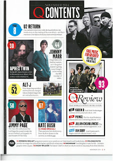
These contents pages have many similarities such as the page numbers are all in pugs, however on Mojo magazine the pugs are the same size, colour and shape. The layout is rather similar as there are several photo and text about them. However it is different because the photos on the Q magazine are surrounded by the images but it is by the side of the images on the Mojo magazine.
I prefer the layout of the Q magazine as I feel it is slightly more modern and the text is more specific to the photos as the text surrounds the photos. Q would more than likely attract a younger audience due to the artists they use and the modern layout.
Tuesday, 6 October 2015
Sunday, 4 October 2015
Research- hairstyles which inspire me
I really love this hairstyle, it's so simple yet beautiful. It's not a huge updo but it is still loosely styled, however it does still look very natuaral and slightly messy. This makes for a pop or pop-punk look as it is modern and cool. I believe this hair style goes against what Laura Mulvey says 'that women do things for men' as although it is slightly styled it's messy and not a posh updo so the model is doing it for herself not to impress anyone.
Saturday, 3 October 2015
Researching Different Genres
The main feature of this magazine is clearly the artist, this is created as the convention of putting the artist behind in front of the masthead is used, it really brings the artist right to the front of the magazine.
Stereotyping is very pronounced in this main image, the artist is wearing a big cowboy hat, which is very country like. The photo is also not shot in a studio it looks like a field although the background is not in focus I can see what looks to be tree with sunlight glistening through them, creating a definite mise-en-scene of country side. This feature also goes against what Richard Dyer says that 'A star is an image, not a person' as the photo is not shot in an artificial environment. Both these signs add up to an indexical sign of a country person.
The main colours of the magazine are red and black, all cover lines are in these colours, this is effective because it looks very uniform. The fonts are all similar filling the serif house style of the usual masthead. The only different colour is the pug at the top of the page, this also contains a alternate font, this makes it really stand out, especially because of the bright yellow.
I think this magazine will be more aimed at the male gender due to the fact that the artist looks serious and focused on his music, there are no symbolic female colours associated in the front cover either.
Things I'm Learning
Since I have began studying Media Studies I have learnt many new skill on many different websites and devices. New devices I have been using or using in new ways:
- iMac
- iPhone
- iPad
- Mac book
- Panasonic Lumix Fz62 camera
- Scanner on printer
- Memory card reader
- Slide share - I have been using this to post power points on-line, then I have learnt to embed them in order to post the on my blog.
- I have also been learning how to use Flickr, this is really useful to me because I can get opinions on my best photos and know which would be best to use for certain situations.
- I have used Adobe Elements 11 Photoshop in order to create the front cover of my college magazine, I have learned to used features such as the magic rubber and colour select.
- The website I have learnt the most on is using a blog, I have learnt to; embed a slide share, post a blog, add a photo to a blog. I have also learnt how to change the format of my blog to make it personal to my genre.
Research Synergy 1 kerrang magazine contents 2 front 8
This Kerrang front cover creates synergy with the contents page in several different ways. Such as the main theme on this front cover is the '51 Greatest Pop-Punk albums ever' and on the contents page this is featured again.
There is a bright yellow that pops on the front cover headline, this is also used on the subheadings used on the contents page. This creates further synergy with the front cover.
Bring Me The Horizon is also featured on the front cover in the corner and then again twice on the contents page. The same artists are mentioned on the front cover and contents page which really brings the cover and contents page together, to look like they are from the same magazine.
There is one contents page on this magazine, it features 18 of the stories on the inside and has 4 images on it. Similar fonts are used in the contents page as are on the front cover they are in different sizes and colours however.
Synergy is very important in magazines as it makes the magazine its styles, I want the cover to link with the rest of the magazine so I know they are from the same magazine. For example I do not want to be reading a Rock magazine by Kerrang and see synergy with the magazine Classical as it does not make sense or relate to the genre.
How this magazine has inspired me
I love how all the featured artists appear to be exploding out from behind the main headline, it adds a really cool rock look. Since I want to create a pop or pop-punk magazine it could be a great effect to further exploreFriday, 2 October 2015
Research Analysis Front cover 7 Taylor Swift - Theorists
This photo of Taylor Swift is very feminine and beautiful, this is a very flattering. Her hair and make up is very done up and typical of a women, the way Taylor is sat is in a very sultry manor as well, therefore this does support Laura Mulvey's beliefs that 'women do things to impress men' very strongly. However Taylor is a very modern artist and Laura Mulvey's opinion is a very old and not up to date at all.
'A star is an image,not a real person', this is a quote from Richard Dyer. This is relevant to this front cover as Taylor's image is shot in a studio. Another big thing I notice is that Taylor's make up and clothes are very different of that that she usually wears, she has a very country style. However this would not suit the cover of this rock magazine so the star has changed her style to fit the criteria of this magazine. Her make up is much heavier than you would usually find on Taylor, this is very typical of a rock chick, not someone who plays country music. Her hair is slightly messy which is another sign of a rock chick. Together all these signs are an indexical sign of a rock chick, therefore she has been represented as a rocker girl.
Stuart Hall has a very modern approach to representation,'things are changing. Representation can't be fixed and should be changed along too'. So maybe this image of Taylor as a rock chick could truly be a part of her, she may just be trying to keep up with the times. This would mean Taylor is going totally against Laura Mulvey's theory that women do things for men, because Taylor would be doing this entirely for herself.
How this Magazine had inspired me
I like how the masthead is behind the artist because it makes the artist really pop on the front cover, looking 3D and even more of the main story than the artist already did.
Thursday, 1 October 2015
Research- Make up which Inspires me
When I saw this make up look it made me think of my magazine and inspired me. I like the make up because it's very feminine and sultry, this slight my agrees with Laura Mulvey opinion that 'women do things for men' but I still think it disputes this slightly too because it is slightly dark and dramatic, not like a pretty little girl. I think it looks really beautiful and would look great on my magazine cover.
Subscribe to:
Posts (Atom)